A scalable packaging system and digital extension for an Austin-born functional coffee brand.
- Services
- Packaging redesign, Packaging architecture, SKU rollout, Production artwork, 3D mockups, Website
- Timeline
- 2025
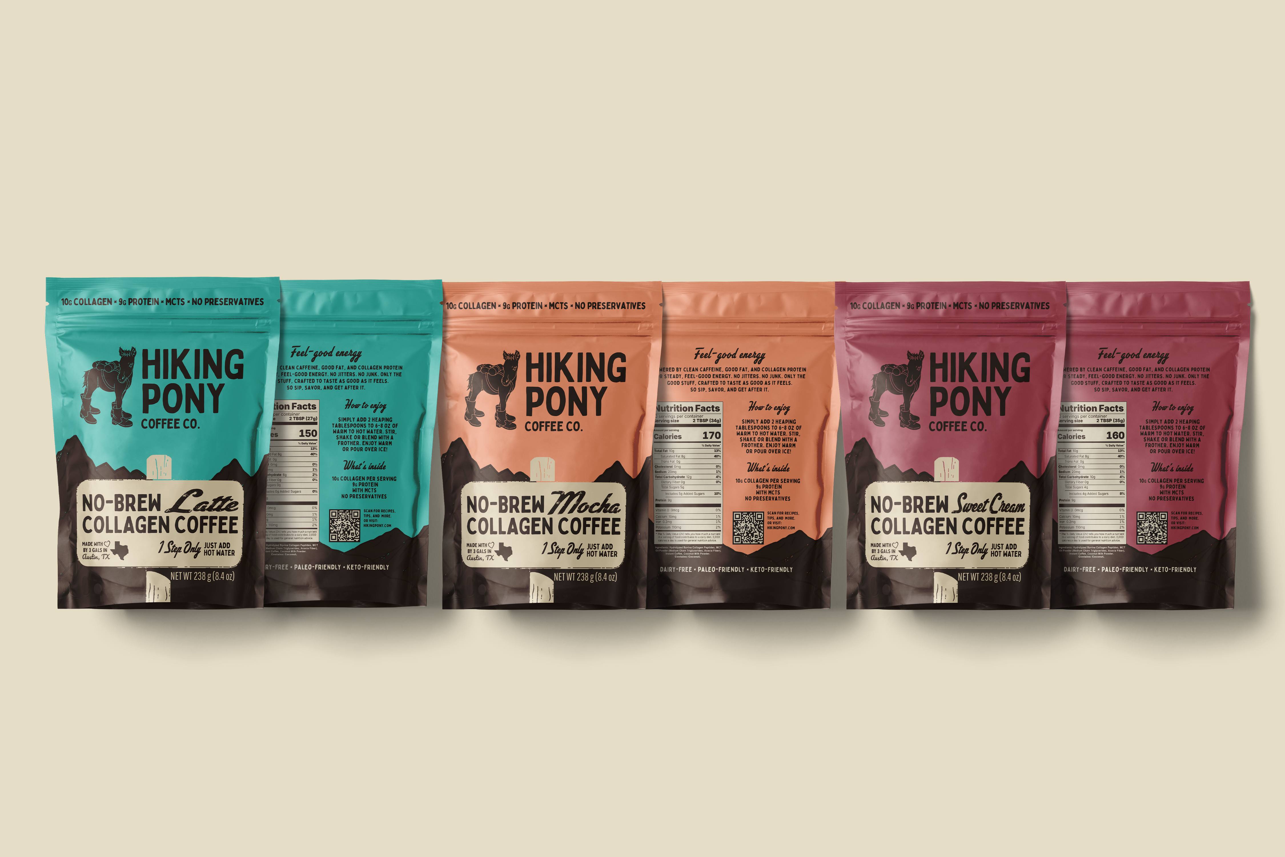
One system, built to scale.
Hiking Pony needed to carry its existing identity from single-serve sachets into a larger retail format without losing the brand’s outdoor character or functional message. We translated the system into 10-serving pouches with a repeatable architecture for changing flavor names, product weights, and serving details.
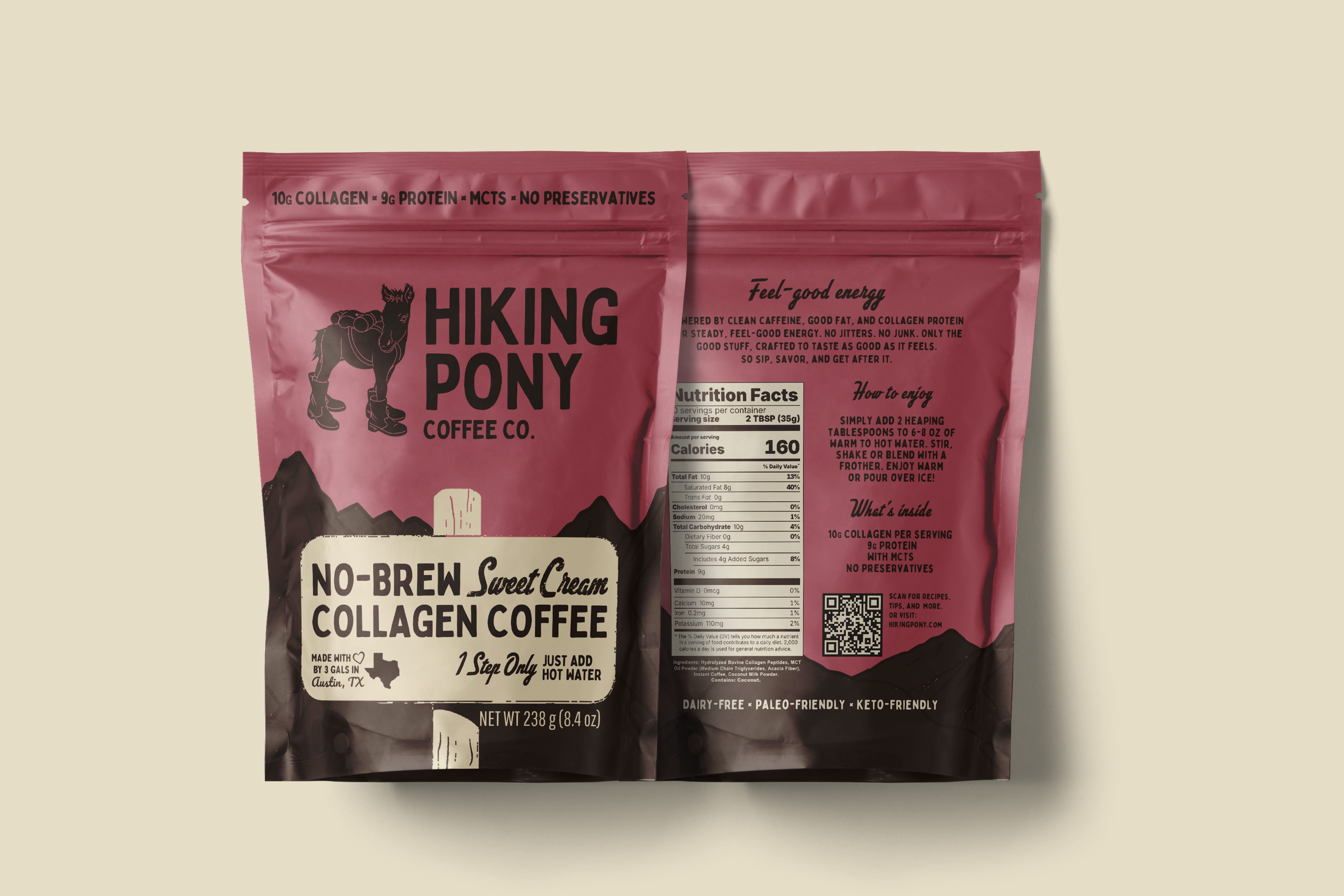
Make the function easy to find.
A clear top-of-pack line brings collagen, protein, MCTs, and preservative-free messaging into immediate view. The front balances the Hiking Pony mark, flavor, product format, origin details, and preparation cue, while the back organizes the brand story, directions, nutrition panel, ingredients, dietary badges, and QR touchpoint.
Four flavors, one architecture.
The packaging framework was prepared across Latte, Mocha, Sweet Cream, and Peppermint Mocha. Shared placement and typography make the range recognizable as one family, while flavor-led color gives each SKU a distinct shelf presence.
Ready for production.
The rollout included single-serve and multi-pack pouch layouts, production-ready mechanical artwork, and 3D product mockups. The result is a flexible system designed to hold together across pouch sizes and product lines.
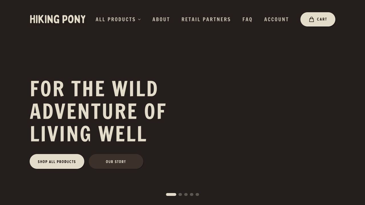
From shelf to screen.
The website extends the same product story through the full coffee range, ingredient information, recipes, retail links, and brand narrative. The QR touchpoint on pack gives the physical system a direct route into that digital experience.