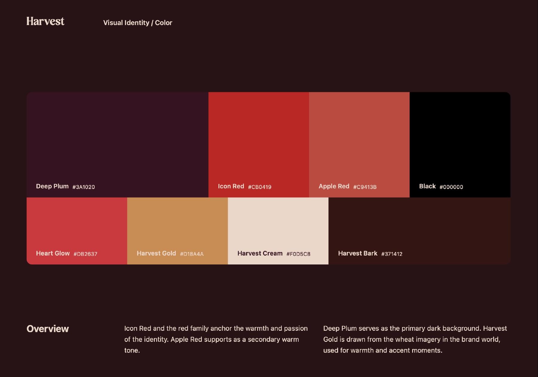
An apple-and-heart symbol, expressive typography, and a plum-and-red palette connecting digital touchpoints.
- Services
- Visual identity, App-icon applications, Social design system
A recognizable starting point.
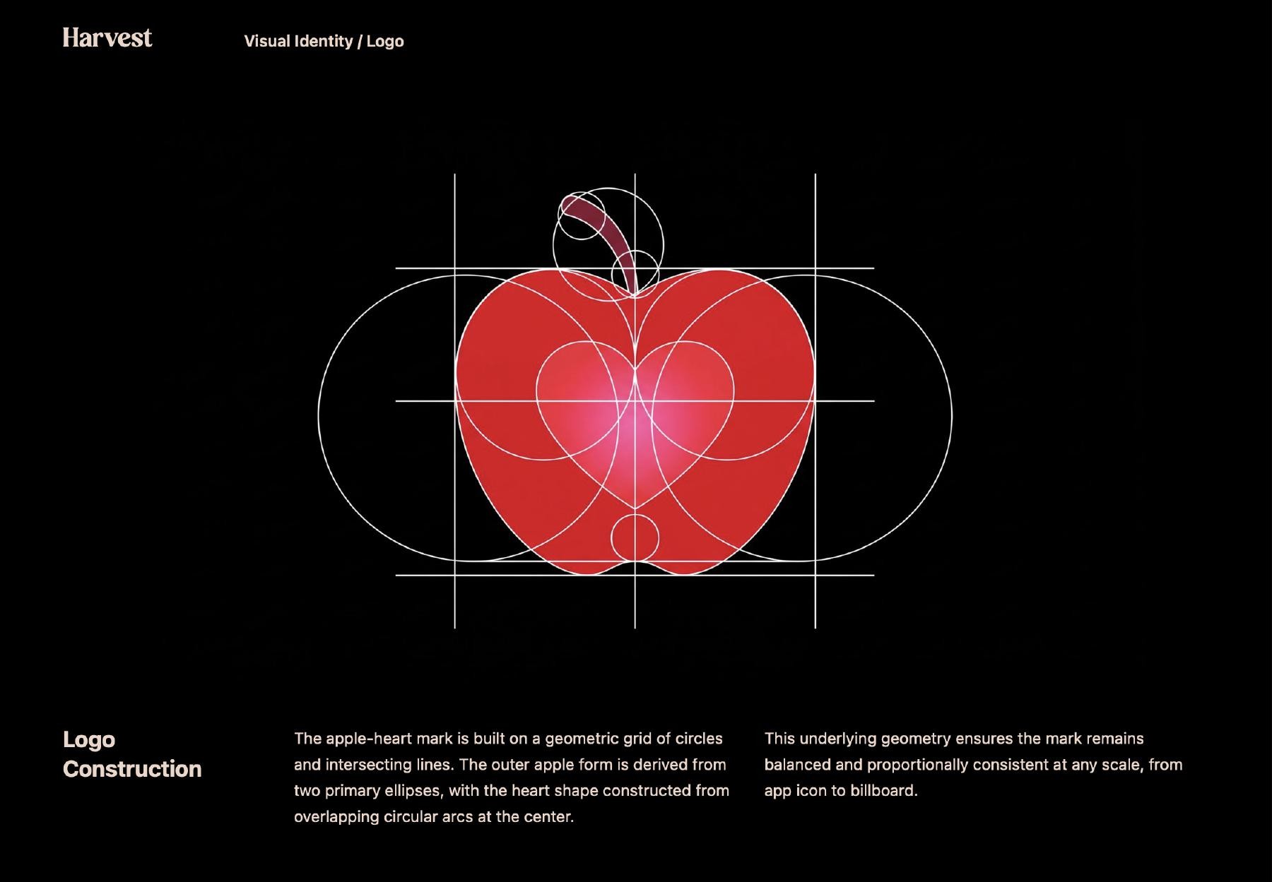
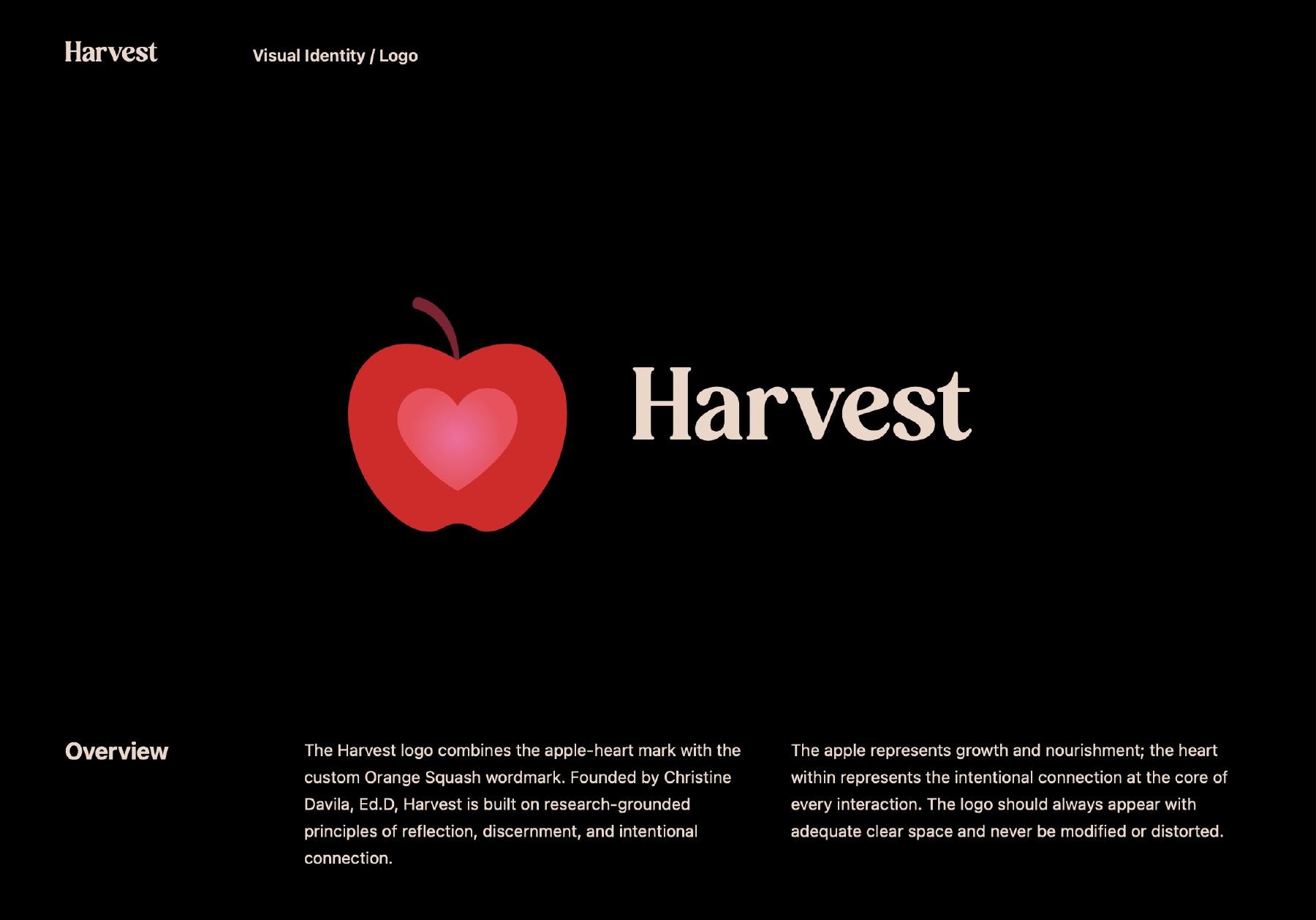
We gave the idea of intentional dating a recognizable visual form. The apple-and-heart symbol is the central identifier, working alongside the Harvest wordmark and independently at smaller scales.
From logo to app icon.
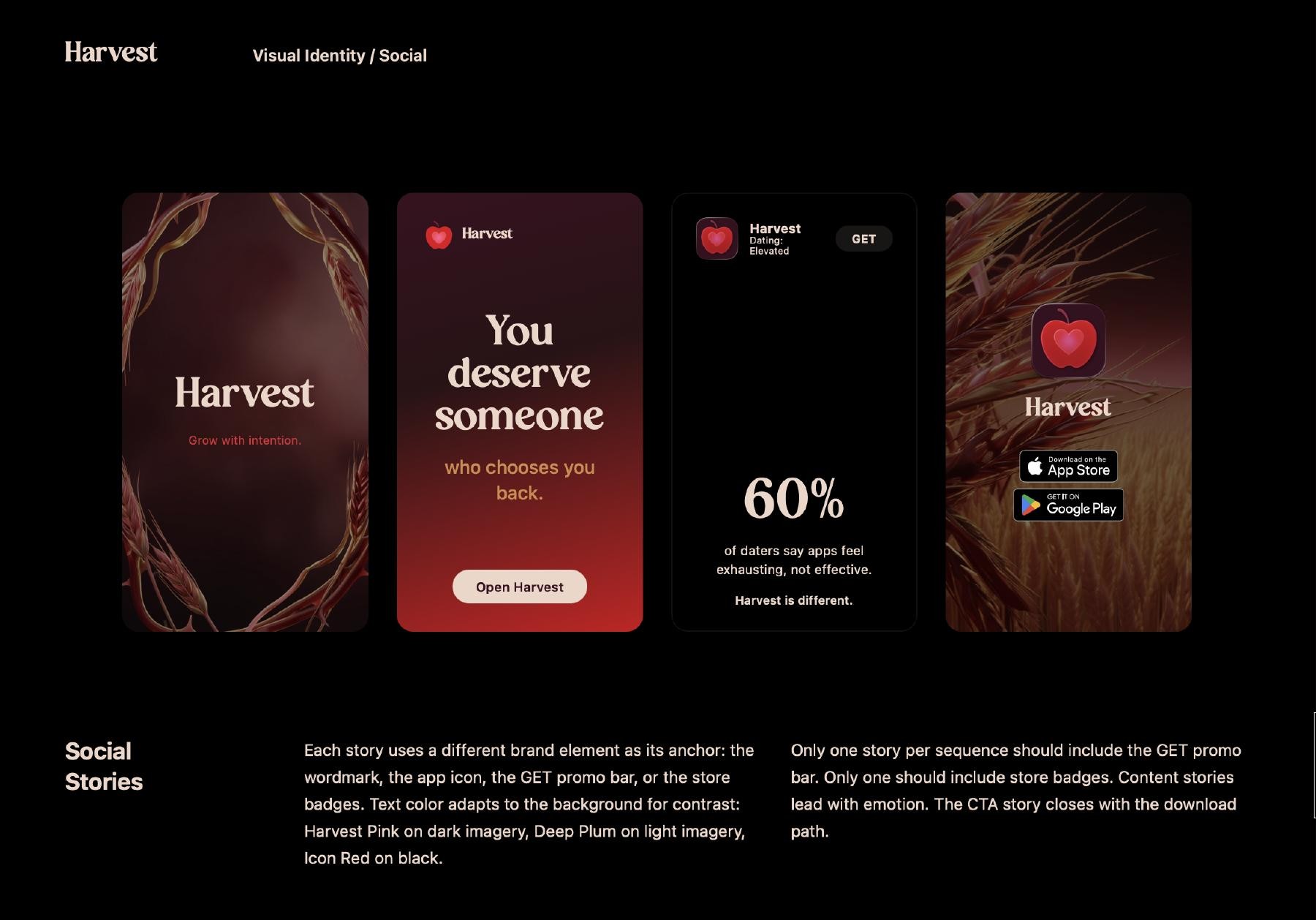
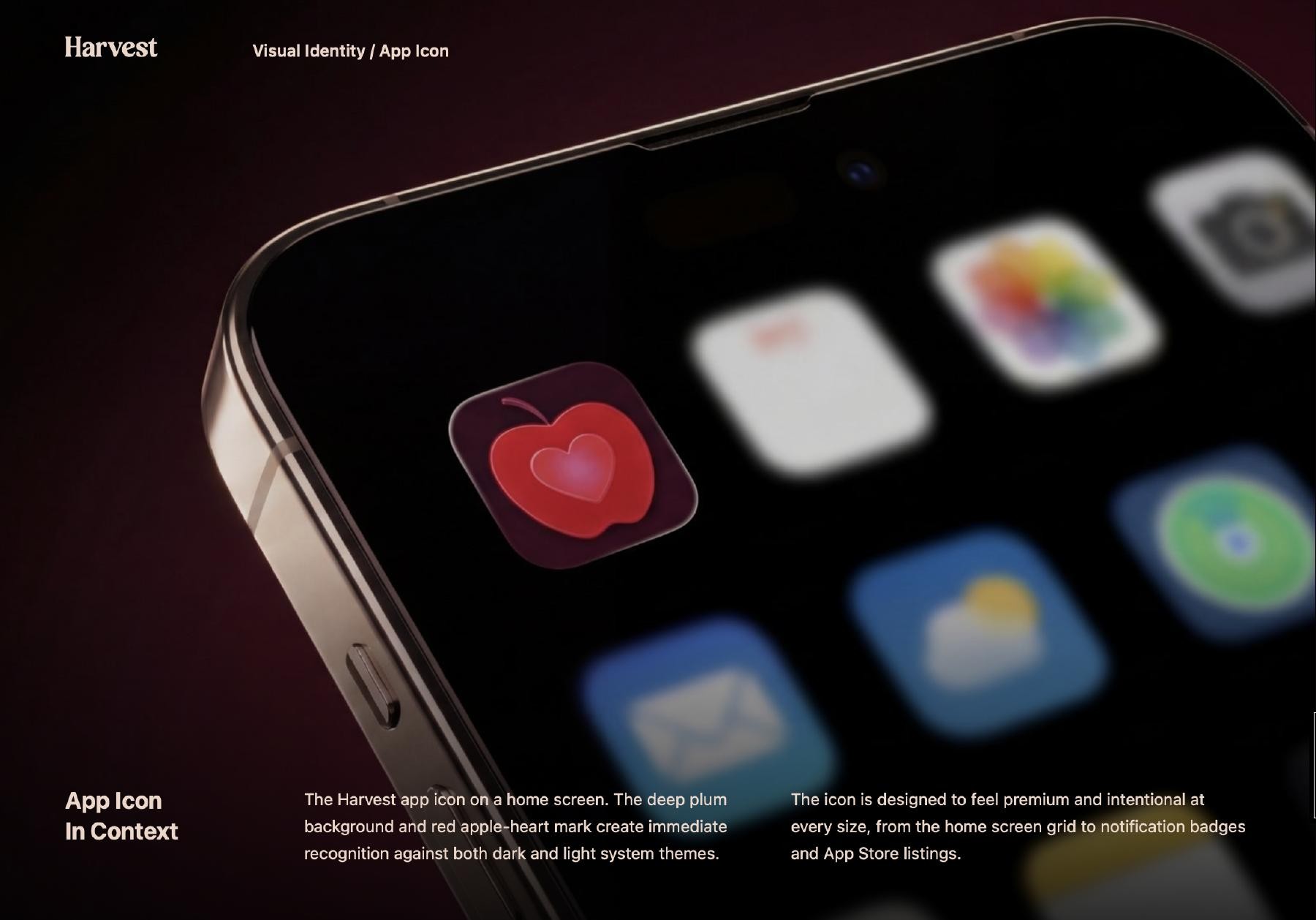
The same symbol connects the primary identity, social stories, and app-icon mockups. Each application changes in scale and format while retaining the relationship between mark, color, and type.
A system with defined roles.
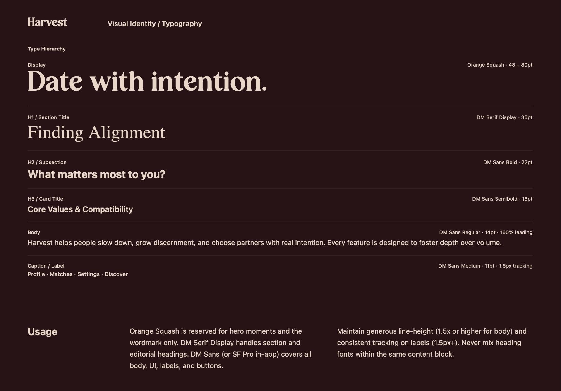
Headline, label, and body treatments establish a clear hierarchy. Plum, red, and supporting tones give different compositions a shared visual structure.